Hana
Hana
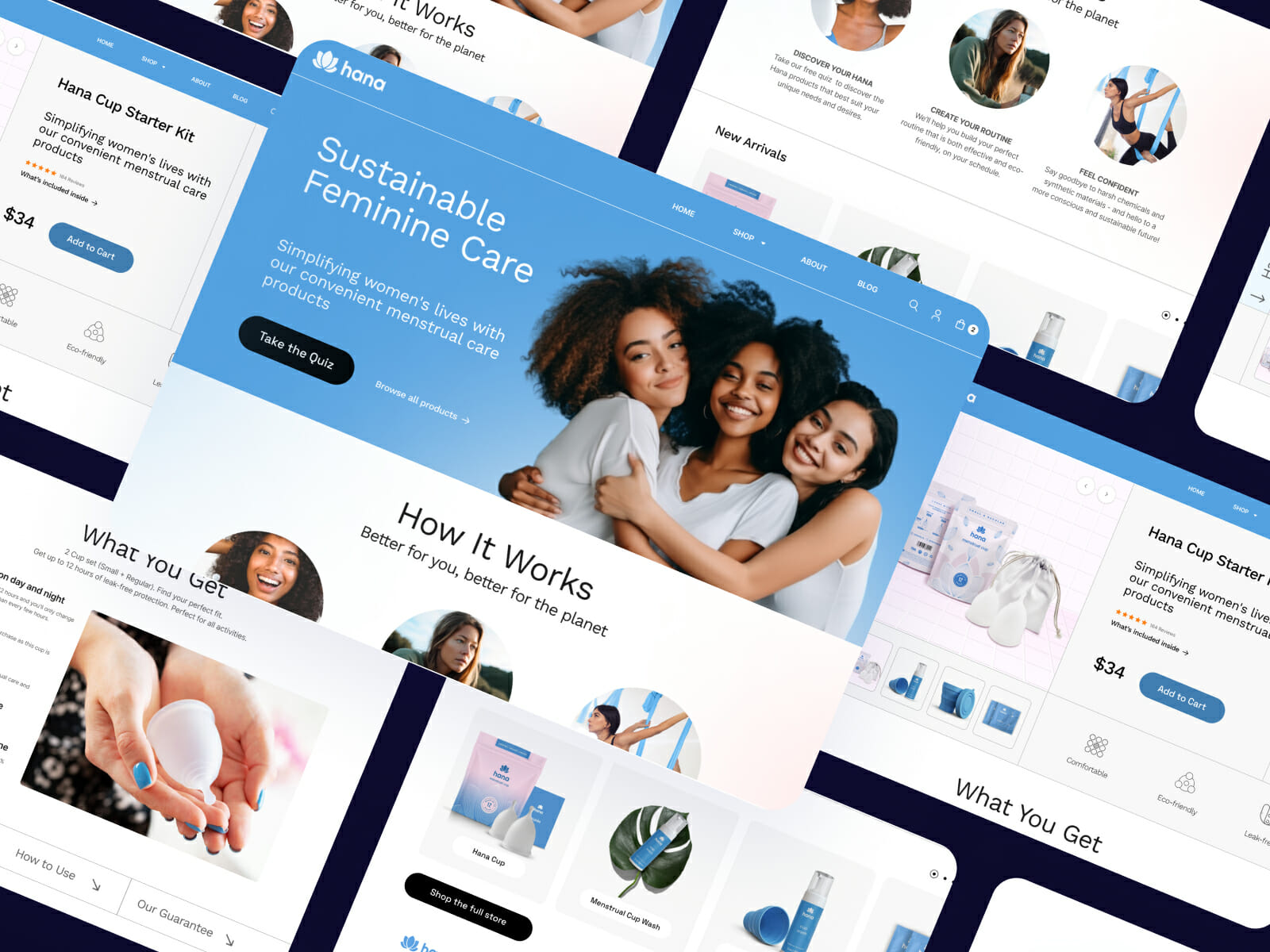
Sustainable feminine care for women who want to take their wellness to the next level.
The Challenge
Solution & Overview
My ROLE
SENIOR UX DESIGNER
BRAND STRATEGY
WEBSITE DESIGN
Key Decisions
Brand Tone
PRIMARY LOGO

SECONDARY LOGO

Primary Background
#5DA2E3
Secondary Background
#427EB2
Tertiary Background
#F9E2E5
Specification Background
#EEF8FF
Calls to Action
#262626
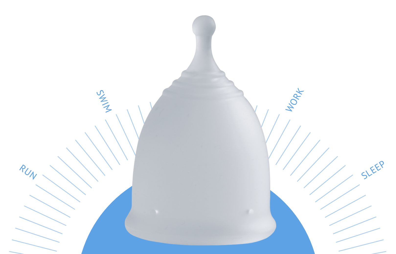
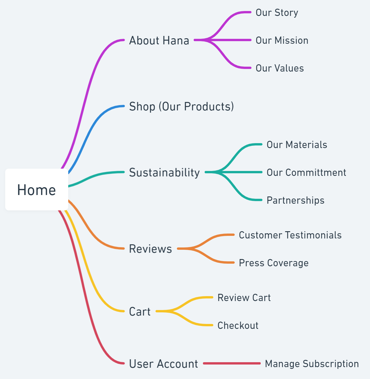
Web Design
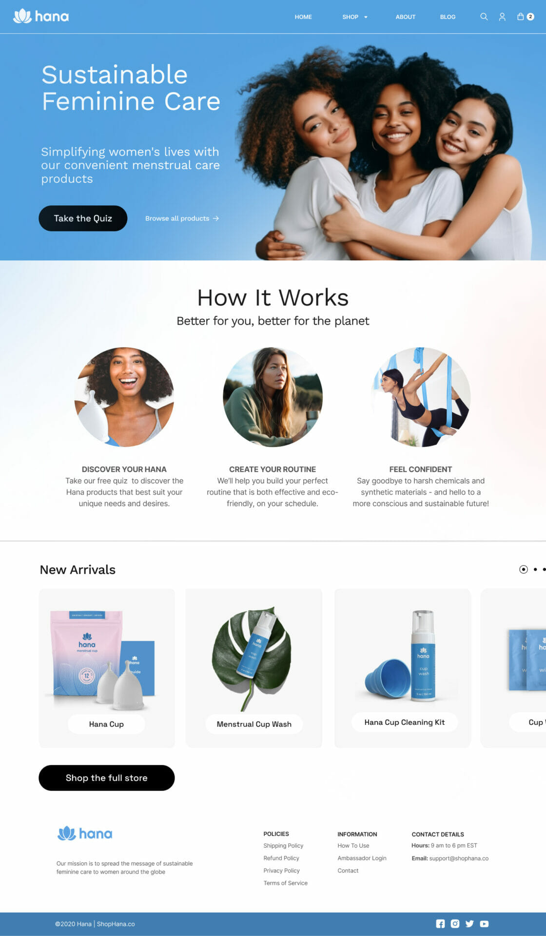
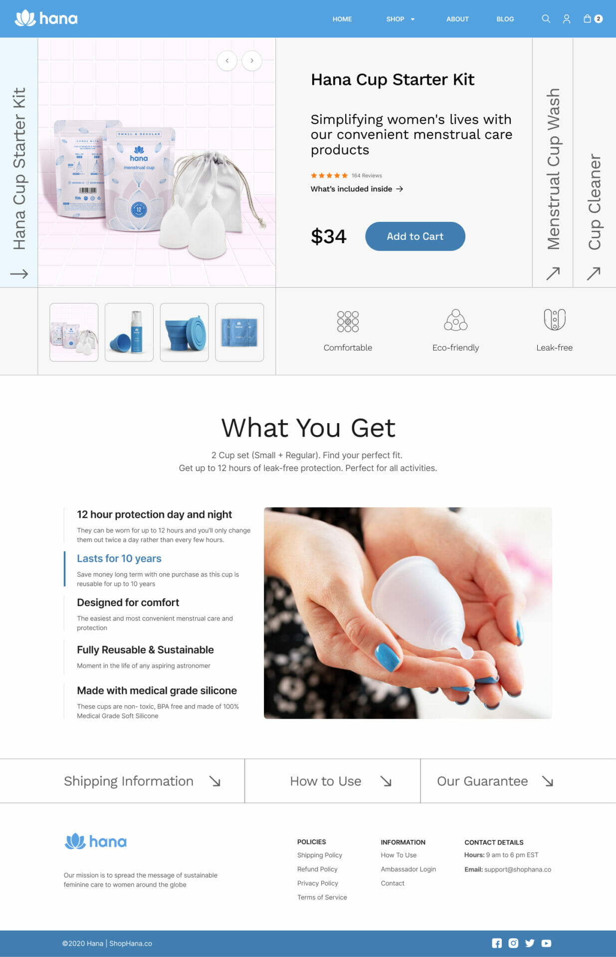
Process Highlights
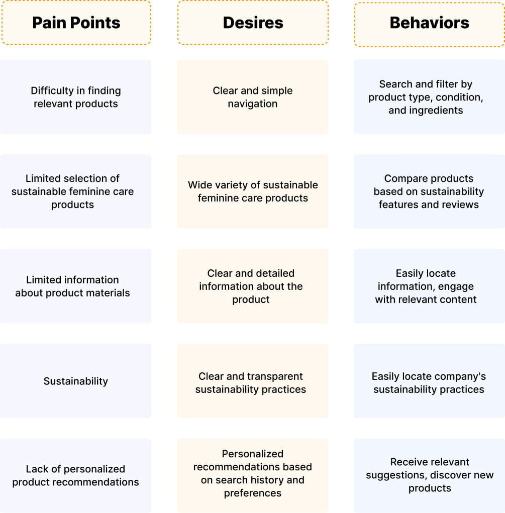
The project began with extensive research into women’s attitudes toward feminine care products, sustainability, and digital shopping behaviors.
Key findings that shaped our approach:
- Women wanted personalized recommendations based on their specific needs
- Trust was primarily built through seeing real people’s experiences rather than scientific claims
- Digital shopping for personal care products required clear visualization of size, texture, and application
These insights led to the development of:
- A quiz-based recommendation engine that creates a personalized shopping experience
- A community-focused content strategy highlighting real user experiences
- Detailed product visualization techniques
Quiz Entry Point
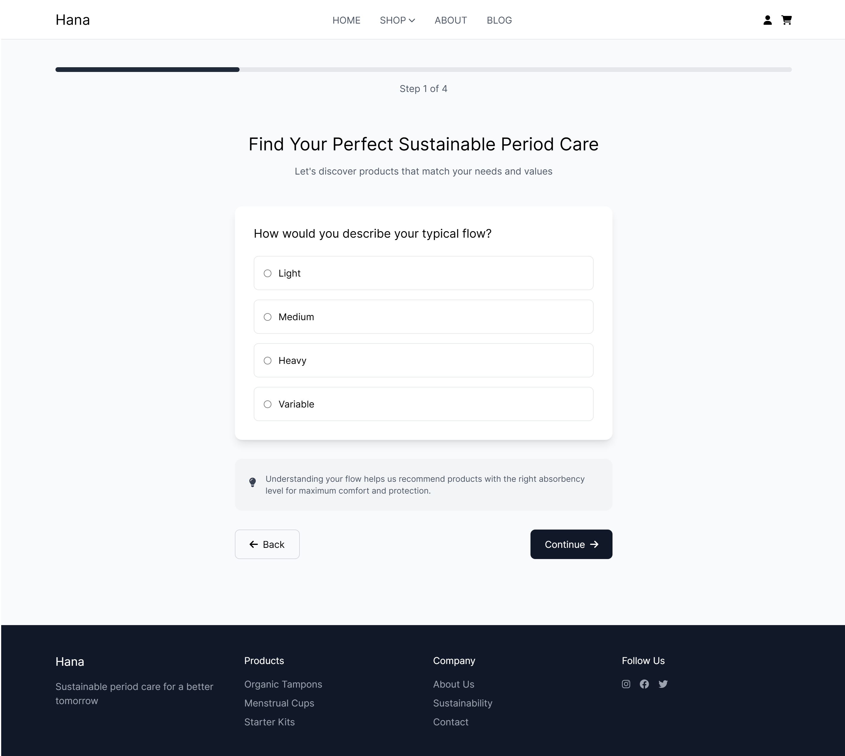
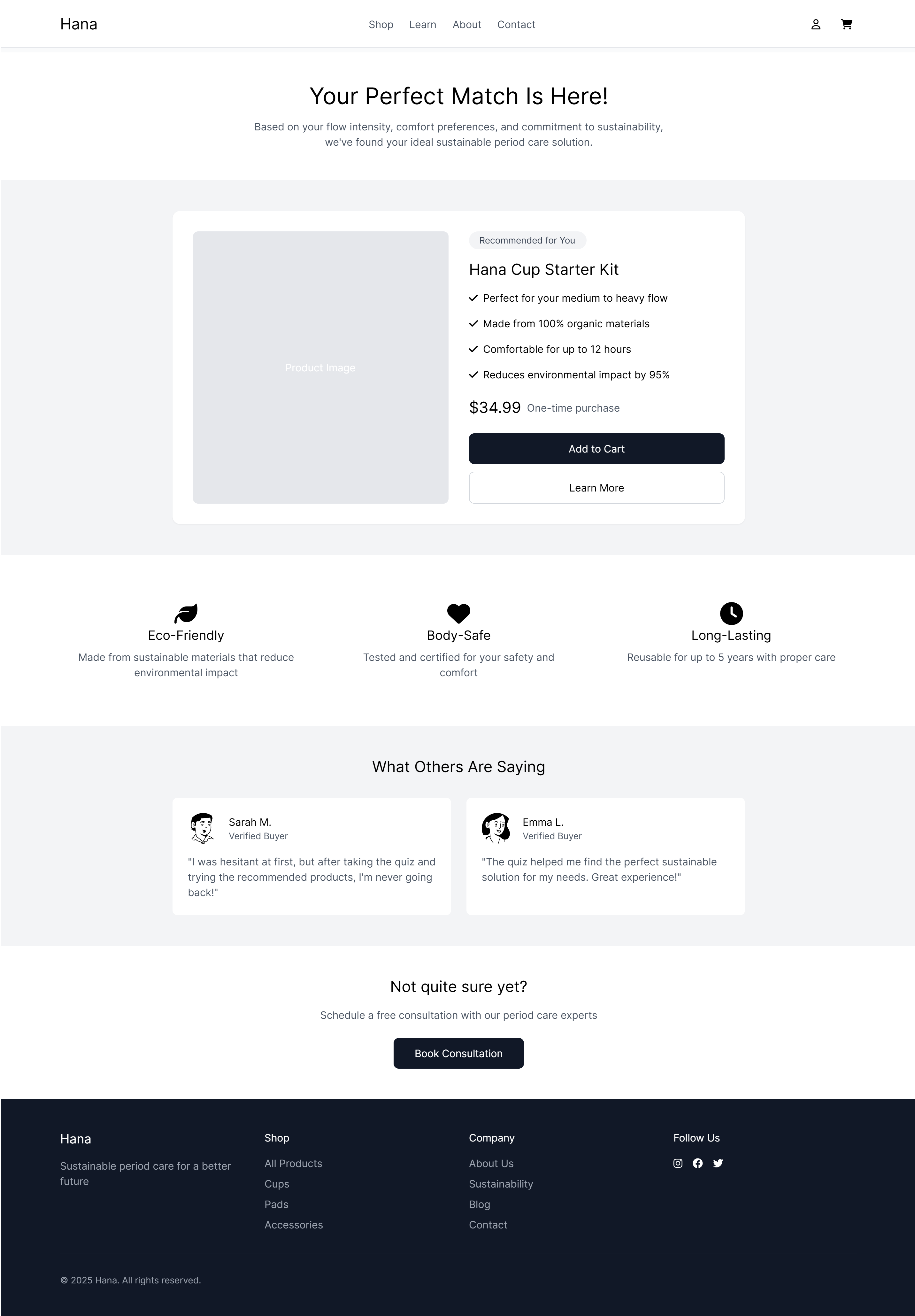
Recommendation Screen
Cart Abandonment
Enhancing Conversion Rates for Hana
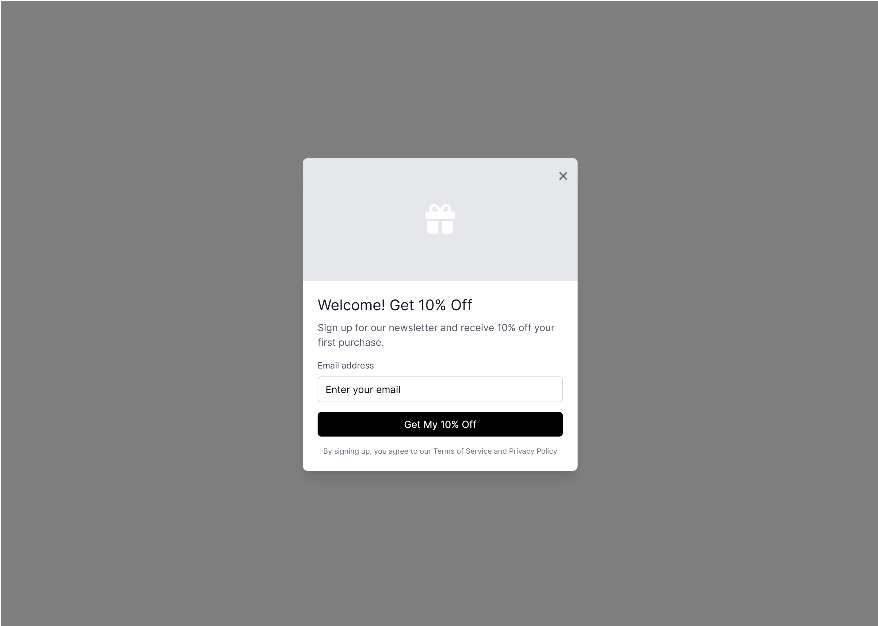
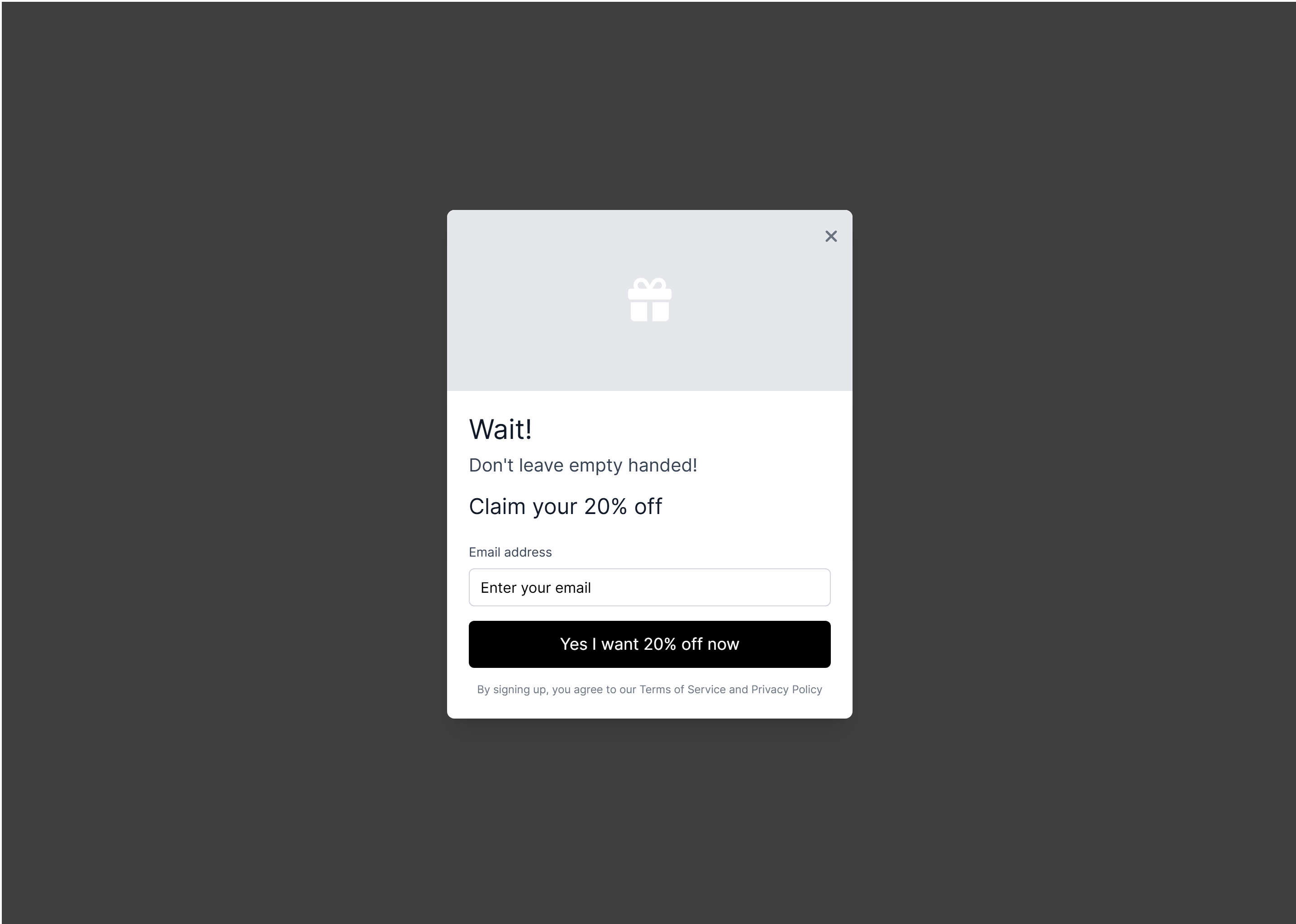
Cart Abandonment Recovery via Website:
-
Exit Intent Pop-ups: Implemented exit-intent pop-ups in the store to engage users who showed signs of leaving without completing their purchase. These pop-ups encouraged users to reconsider and proceed with their orders.
-
Remarketing Campaigns: Utilized remarketing campaigns to target users who abandoned their carts. By showing tailored ads on social media, users were reminded of the products they left behind, increasing the chances of conversion and prompting them to return to a specific Hana landing page.
Cart Abandonment Recovery via Email:
-
Personalized Abandoned Cart Emails: Automated email campaigns were implemented to target users who abandoned their carts. These emails were personalized with product images, descriptions, and a clear call-to-action, enticing users to return and complete their purchase.
-
Time-Sensitive Offers: Leveraged limited-time discounts within the abandoned cart recovery emails. By creating a sense of urgency, these offers motivated users to take action and finalize their purchase.
Bottom Funnel Optimization:
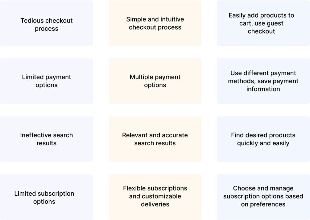
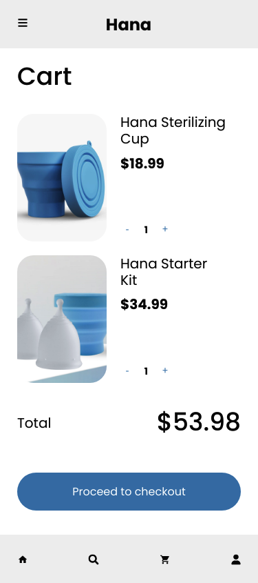
- Streamlined Checkout Process: By reducing the number of steps in the checkout process and simplifying form fields, users were able to complete their purchases quickly and effortlessly.
- Transparent Pricing and Shipping Information: The layout provided clear and upfront pricing information, including any applicable taxes or shipping fees, right from the beginning of the checkout process. This approach eliminated any unexpected surprises for users during the final stages of the purchase.
- Reassurance and Trust Signals: Trust signals, such as secure payment icons and customer testimonials, were strategically incorporated into the checkout journey. These signals instilled confidence in users, assuring them that their personal and financial information was secure.
Mobile Design
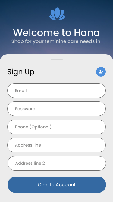
Welcome
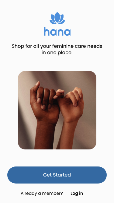
Signup / Onboarding
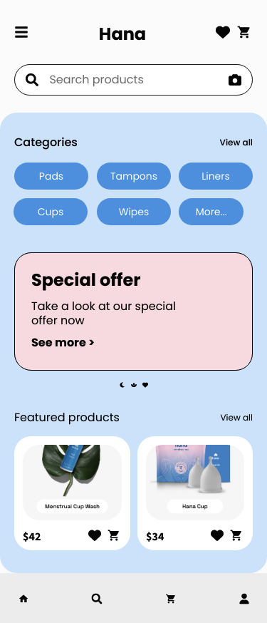
Homepage
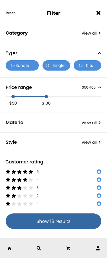
Search / Filter
Product Details

Cart / Checkout
User Persona
Name: Sarah Lee
Demographics:
- Age: 27
- Gender: Female
- Occupation: Entrepreneur
- Education: Bachelor’s Degree in
- Business Administration
- Income: $70,000 per year
- Location: Urban area, United States
Entry Point:
- Sarah is experiencing discomfort with her current feminine care products and is seeking natural and sustainable alternatives
- She begins researching online for natural and sustainable feminine care products that align with her values
- She discovers the product through a Google search or a social media ad
Success Criteria:
- The website provides clear information about the product’s ingredients, benefits, and sustainability features
- The website has a simple and intuitive interface that’s easy to use
- The checkout process is seamless and easy to complete
- The product arrives within a reasonable timeframe and meets
- Sarah’s expectations for comfort and effectiveness
- The brand provides excellent customer service and responds promptly to any inquiries or issues
User Flow:
- Sarah discovers Hana through an Instagram ad about sustainable feminine care. She clicks through to learn more.
- The homepage offers two clear paths: browse products or “take the quiz”.
- Sarah chooses the quiz. Simple questions about flow, comfort, and eco-priorities appear with response options.
- Results show her perfect match with her specific needs.
- She reads transparent ingredient information and real reviews.
- Sarah selects the low-commitment Hana Cup Starter Kit.
- Checkout is quick with minimal fields, make purchasing easy.
- A confirmation email arrives with helpful tips for new sustainable product users.
- Her package arrives with clear usage instructions.
- A follow-up email arrives after her cycle.
- Impressed, Sarah leaves a review and shares her referral code with friends.
Findings:
- Sarah values sustainability and eco-friendliness in her products
- She prioritizes comfort and effectiveness in a feminine care product
- She expects a simple and intuitive online experience
- She values excellent customer service and responsiveness from the brand.
What I Learned
This project taught me the power of guided experiences over self-directed exploration when designing for new product categories. The quiz approach not only simplifies decision-making for users but provides valuable data for Hana about customer needs and concerns.
I also gained valuable insight into designing for sensitive product categories, where trust-building must be integrated into every aspect of the experience rather than treated as a separate section or afterthought.
